
Simplifying enterprise banking for commercial clients
Project Type
B2B, Enterprise Banking, Web & App Redesign
Team
2 UX Designers (Me), 1 UI Designer, 3 Engineers, 1 Project Manager, 1 Design Director
My Role
UX Designer
Timeline
3 months (Sep–Nov 2023)
Overview
CUBEnterprise is Cathay’s enterprise banking platform used by global finance teams to manage accounts and execute high-risk fund operations.
What I did
I redesigned the platform’s core desktop version of the dashboard and workflows to reduce friction, increase clarity, and support scalable operations for teams across regions and roles.
Impact
Turning a fragmented banking experience into a confident, role-aware workflow for global finance teams.
-40%
Workflow drop-off after redesign
3×
Faster transaction start
1.2M
Annual enterprise users served
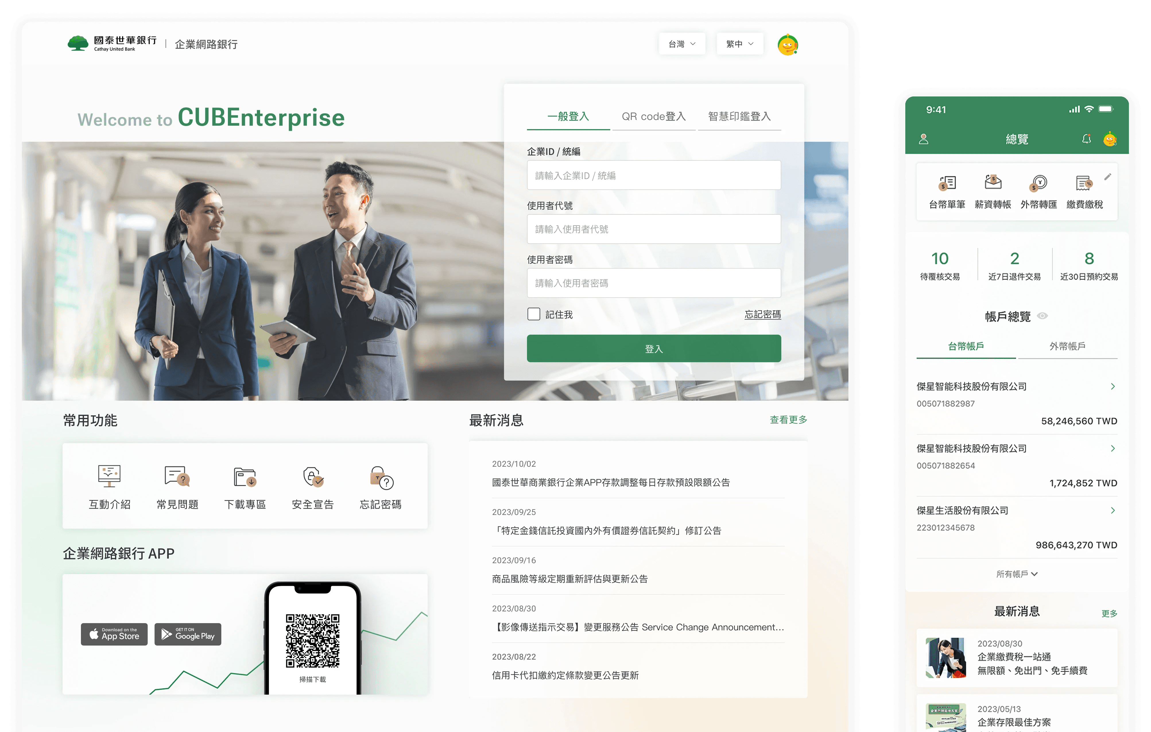
Final Design Preview
Before & After
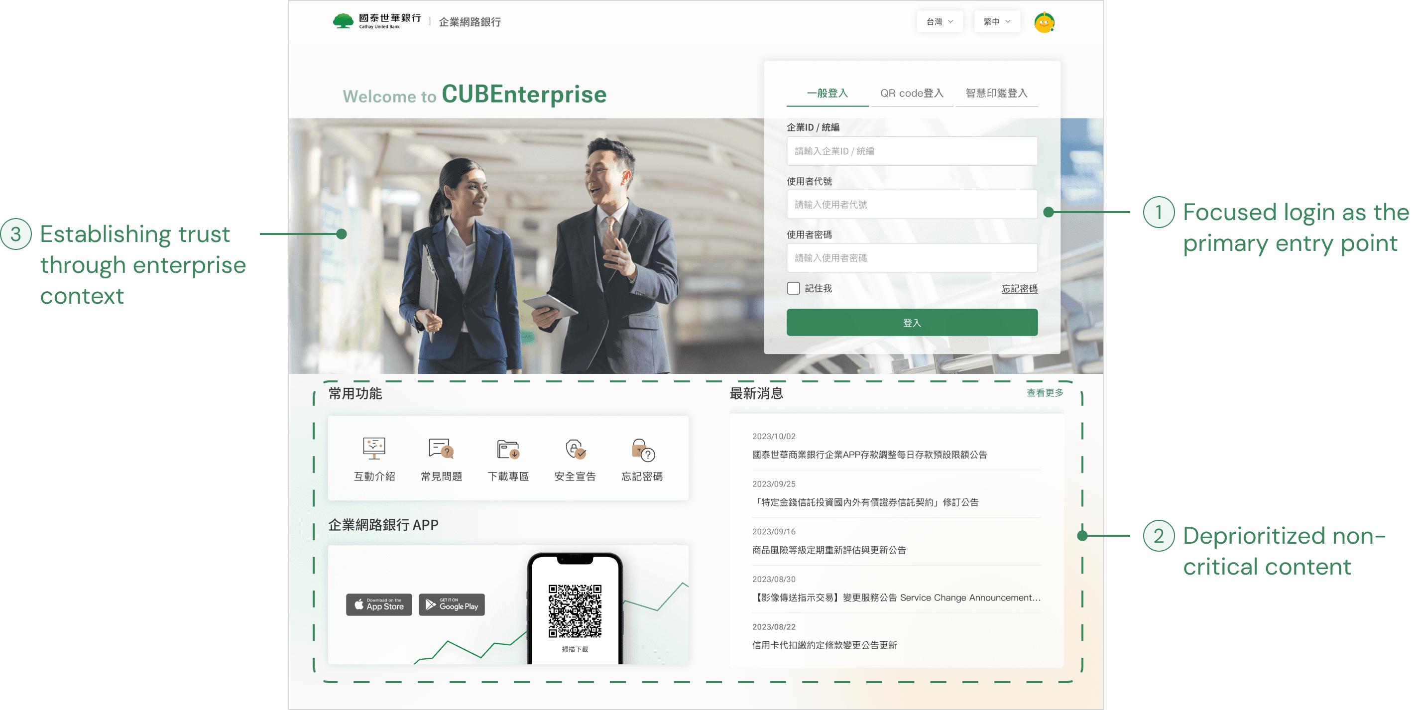
Establishing a trustworthy entry point
Refocused the first touchpoint to establish trust and guide users into the system with confidence.


Swipe to see the before (left) and after (right) designs!
Key feature #1
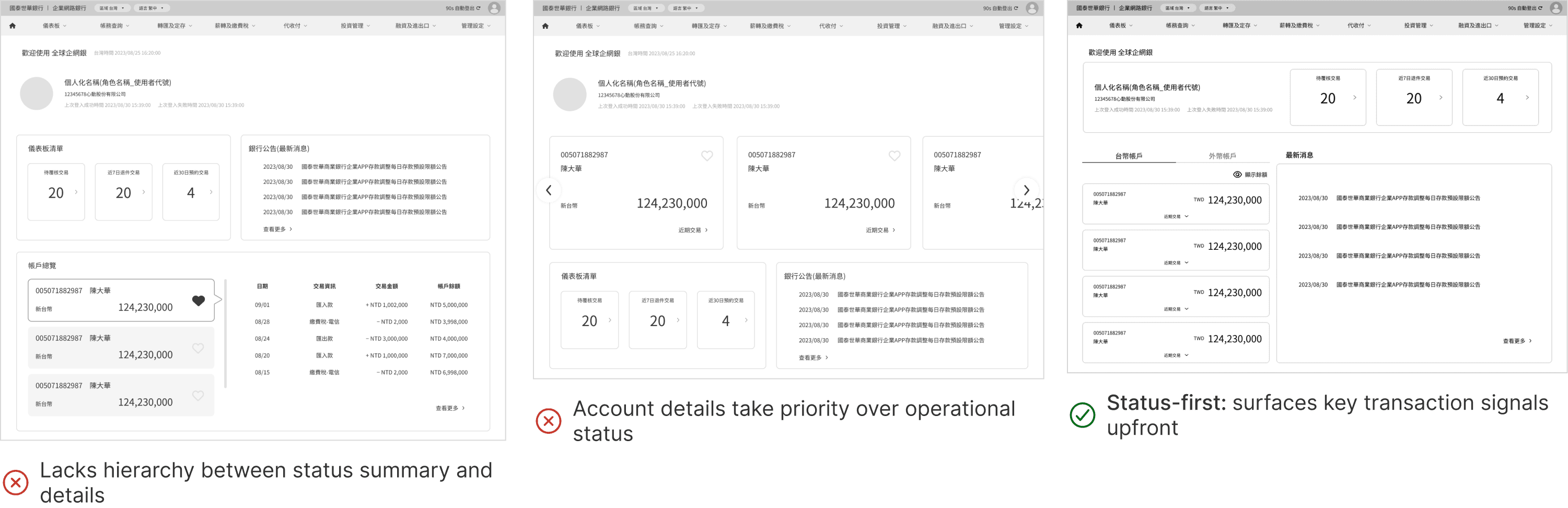
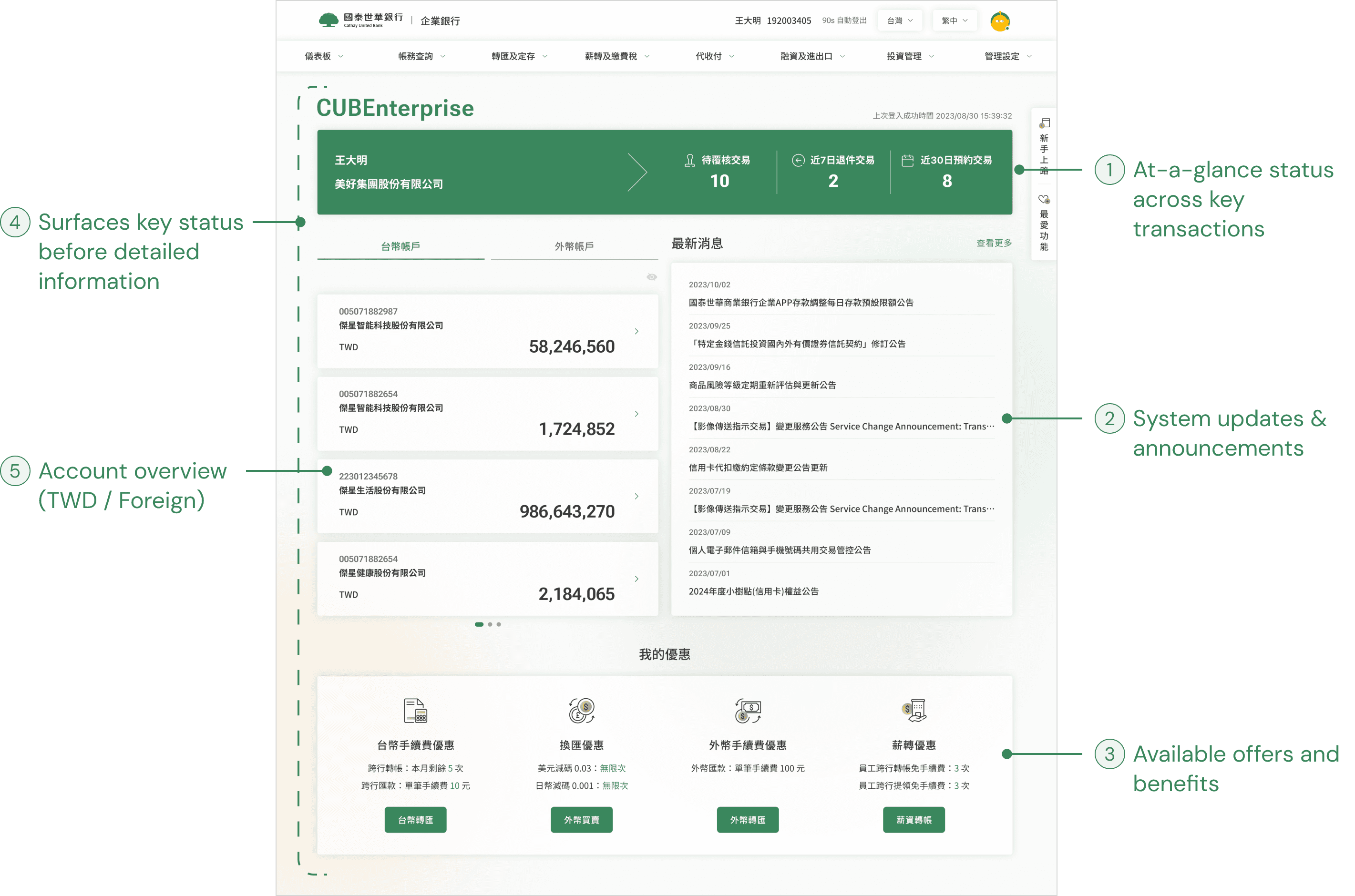
Surfacing key status and summaries upfront
The dashboard serves as the main entry point, surfacing key tasks and summaries.
Key feature #2
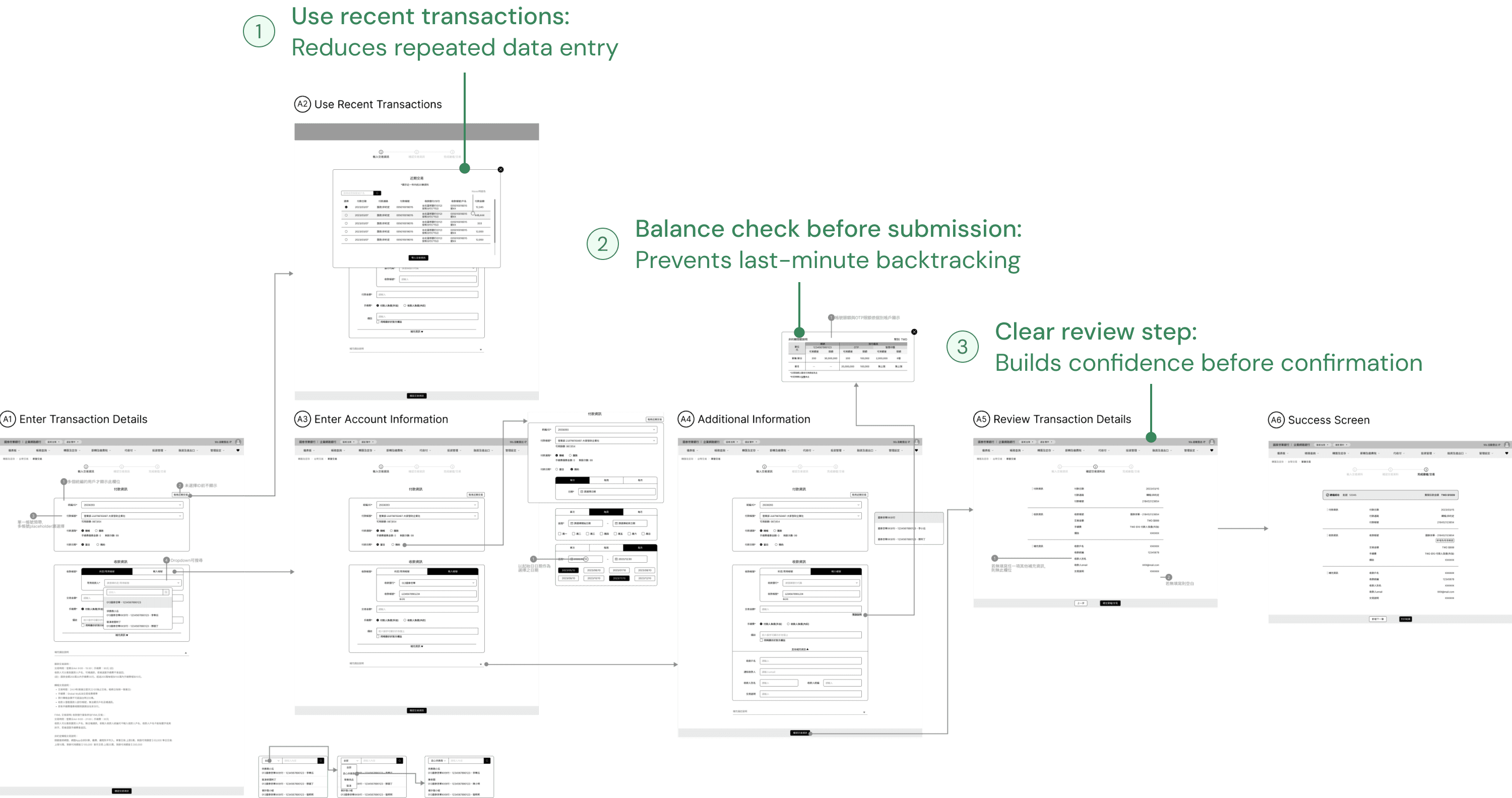
Streamlining transaction flows
Simplified the transfer steps and surfaced key details upfront so users can move through the process confidently.
The Problem
25% of new enterprise users dropped off after their first month
Internal data showed that many teams signed up with clear intent, but did not move forward after initial access. As Cathay United Bank aimed to scale its enterprise banking platform, we needed to understand: what was causing teams to drop off so early, and where the experience was breaking down.
Looking Beyond the Numbers
Tasks, balances, and approvals were fragmented across the platform
To understand why teams dropped off, I mapped how different roles moved through the system. A clear pattern emerged: users had no single place to start, and had to piece together the workflow on their own.
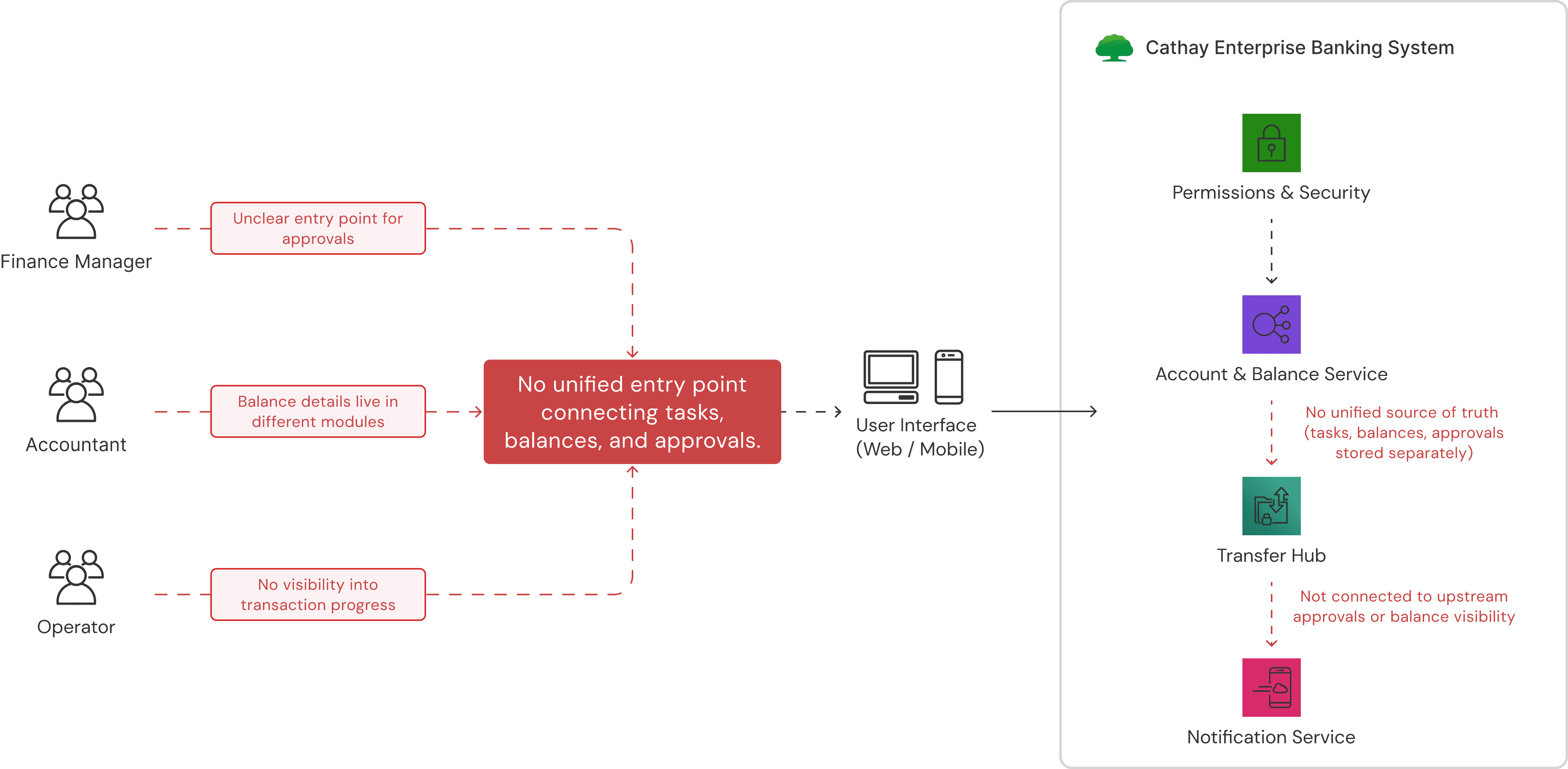
How I Understood the Root Causes
Reducing duplicate payments through balance visibility
To better understand what was driving the early drop-off, I worked with one UX designer from Cathay internal team to conduct 6 user interveiws and reviewed 10+ global enterprise banking platforms.
Key Research Insights
1
Users relied on trial and error to find where tasks lived
I knew what I needed to do, but I kept clicking around to figure out where it was.
— Operations Manager

2
The first touchpoint caused new users to pause
When I first landed on the page, I wasn’t sure what I was supposed to do next.
— Accountant
CONSTRAINTS
Strict regulatory and security requirements
Core flows and audit trails were fixed. Steps could not be removed or simplified.
Fragmented legacy systems
Tasks, balances, and approvals ran on separate backend services.
Organizational and decision constraints
Changes required cross-team sign-off with minimal disruption to existing clients.
Within these constraints, I collaborated with engineers, Cathay’s design lead, and business partners to define a focused MVP, prioritizing the entry experience and core workflows that most impacted early adoption. I took ownership of redesigning the web landing experience as the first point of intervention.
Design Goal
How might we help new enterprise teams confidently move forward by clarifying where to start and how work flows across the system?
MVP Focus: Landing page
Design Exploration
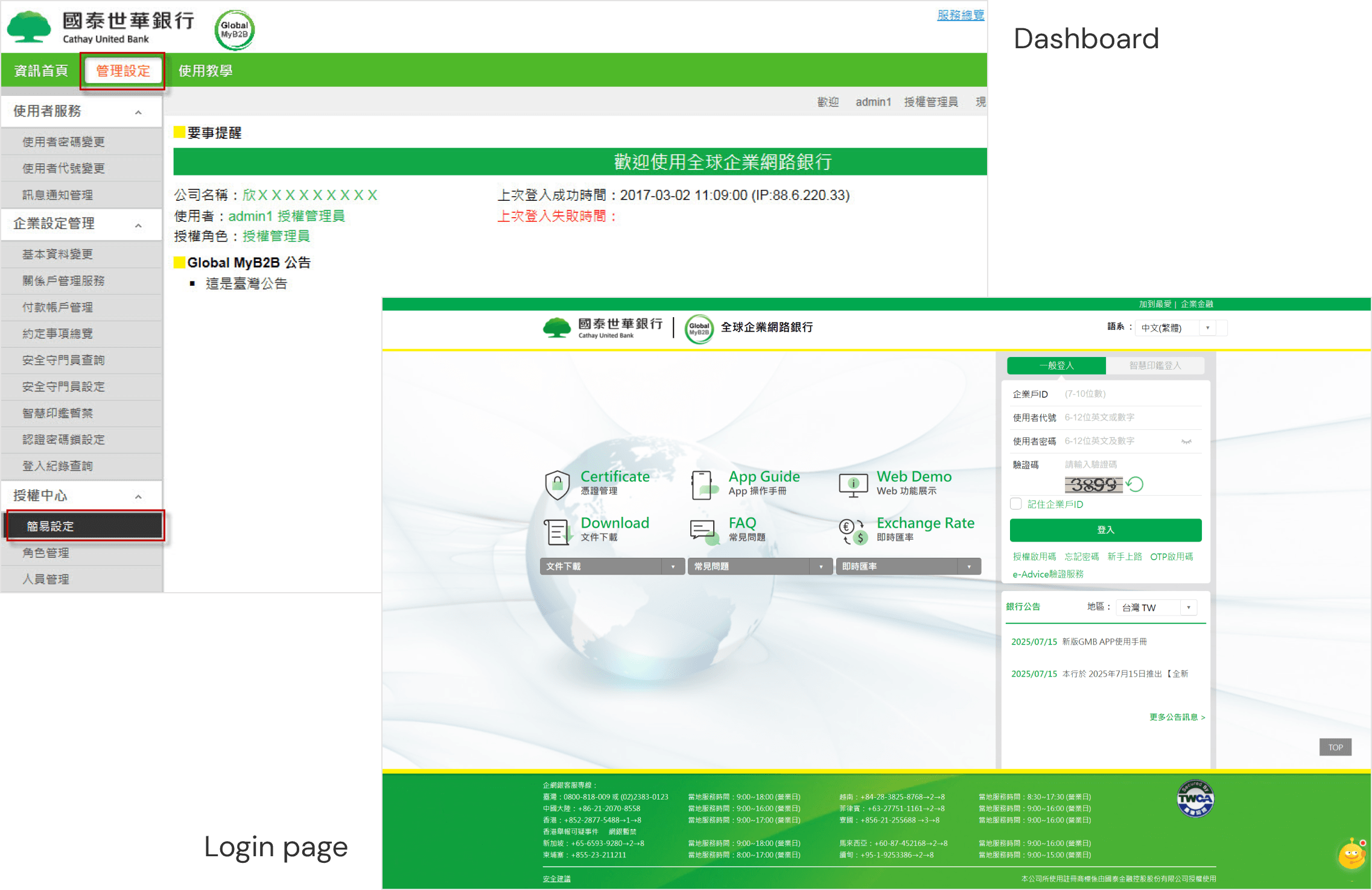
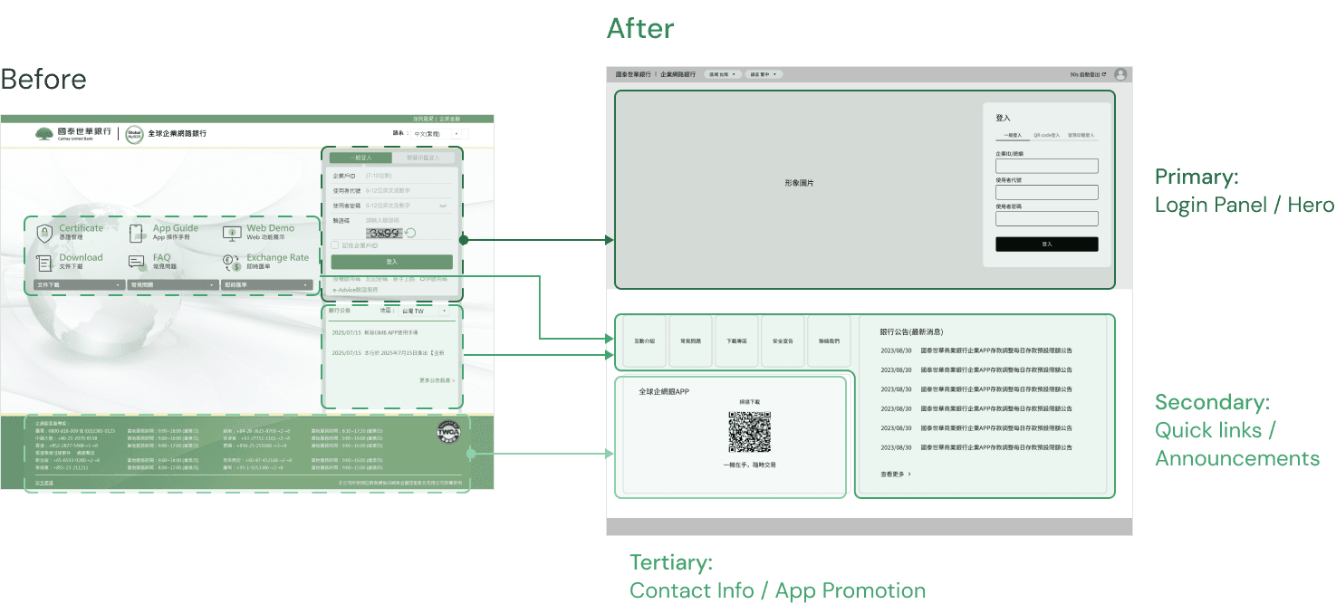
Reframing the landing experience
The previous landing page mixed too many modules and outdated UI patterns, making it difficult for finance teams to quickly understand balances or know where to start. I prioritized the login and key actions to make the entry point clearer.
MVP Focus: Dashboard
Design Exploration
Make transaction status clear at a glance
From the interviews, users point out that the current dashboard lack visibility of transactions and key tasks, making it difficult to manage. I explored multiple dashboard layouts to identify a structure that surfaced the most critical operational information upfront and supported faster decision-making.
MVP Focus: Transaction flow
Design Exploration
Reduce back-and-forth in frequent transaction flows
Many users repeatedly went back and forth during transactions. To reduce uncertainty and unnecessary loops, I focused on streamlining the high-frequency workflow while keeping required validations intact.
Final Solution
A unified entry experience that helps enterprise teams know where to start and how to move forward
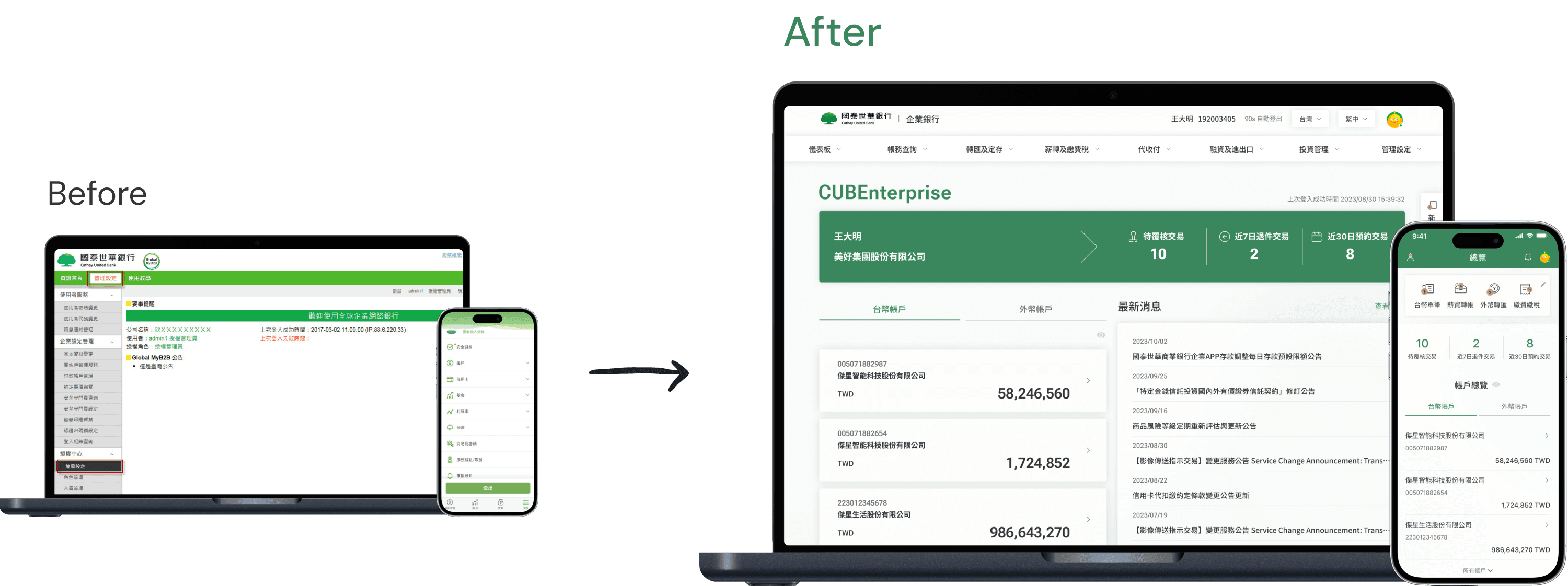
Before

No clear starting point after login
Tasks, balances, and approvals were spread across different sections
Users had to navigate and verify information before moving forward
After

A clear starting point immediately after login
Key tasks and summaries surfaced upfront
Streamlined transaction flows
Landing Page: A focused entry point that builds trust from the first interaction
Dashboard: Key account status and tasks surfaced at a glance
Impact & Takeaways
The redesigned dashboard improved both task clarity and efficiency.
After launch, early drop-off among new enterprise users decreased, we also got positive feedback from the internal team.
−40% Workflow drop-off
Measured by who were unable to complete key tasks across workflows.
Failure rate decreased from 50% (3/6) to 17% (1/6).
3× Faster transaction initiation
Measured by time from landing on the dashboard to initiating a transaction.
Average time decreased from 90 seconds to 30 seconds.
My takeaways
I realized clear hierarchy helps users act faster by showing what matters first. In enterprise products, clarity builds trust. When users know what’s going on and what to do next, they can move forward with confidence.
Reflection
Designing with strict contraints
This was my first time designing for an enterprise banking product, where strict regulations set clear boundaries on what could change. Instead of trying to remove complexity, I learned to work within these constraints by focusing on structure, hierarchy, and decision clarity.
Through close communication with PMs, engineers, and the Cathay team, I learned how a designer can drive alignment and move decisions forward in a cross-functional environment.
Data > opinions
Instead of relying on intuition, I pushed myself to ground every design choice in evidence. This made cross-team discussions easier: conversations shifted from “I think…” to “Here’s what we’re seeing, and here’s what solves it.” It taught me how to align design with measurable impact, not just aesthetics.
If I had more time…
If I had more time, I would explore how proactive system guidance could help users understand what requires attention as workflows become more complex, while staying within existing regulatory constraints.