

Project Type
Enterprise SaaS, Fintech, B2B Platform
Team
1 UX Researcher/Designer (me), 2 Engineers, 1 Project Manager, 1 CEO
TOOLS
Figma, ProtoPie
Timeline
3 months (Jun–Sep 2025)
Overview
Marketeq Wallet is a 0→1 desktop web wallet built for clients managing payments across multiple IT consulting projects.
Returning clients struggled to understand their available funds because balances were distributed across projects and funding states. This often led to duplicate payments, unnecessary refunds, and additional operational overhead.
What I did
Led end-to-end UX research and product design
Reframed the problem from refund speed to balance visibility
Partnered with the CEO, PM, and engineering to design the wallet architecture
Designed a project-first financial experience for returning clients
my Impact
From "Do I still have available funds?" to confident payment decisions.
+45%
Clearer balance visibility
-62%
Fewer duplicate payment attempts
0→1
Enterprise wallet
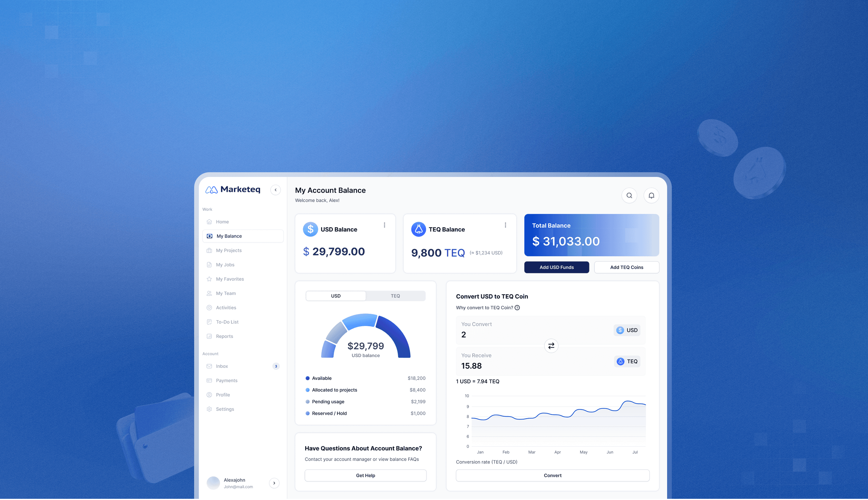
Final Design Preview
Balance breakdown
Clarifies available, allocated, pending, and reserved funds across both currencies.
Project-first hierarchy
Reorganizes financial information around projects instead of funding states.

Dual-currency balances
Provides a unified balance view across USD and TEQ, supporting today's workflow while preparing for future TEQ adoption.

context
As Marketeq expanded, enterprise clients managed an increasing number of prepaid project budgets.
The growing complexity created new challenges for tracking budgets and making payment decisions.

Who are the users?
Operations leads and finance managers responsible for prepaid project budgets across multiple consulting engagements.
What is TEQ?
TEQ is Marketeq's planned platform currency for reusing unused funds across future services. Although it wasn't launched yet, the wallet needed to support its future adoption.
Why dual-currency?
The product needed to support today's USD workflow while remaining compatible with the company's future TEQ roadmap.
BUSINESS challenge
Around 30% of returning clients submitted duplicate payments, increasing operational costs through:
01
Refund processing overhead
Finance teams manually processed refunds for duplicate payments.
02
Support inquiries
Clients contacted support to verify payment status and available balances.
03
Manual operations
Teams manually verified transactions before issuing refunds.
What we initially got wrong
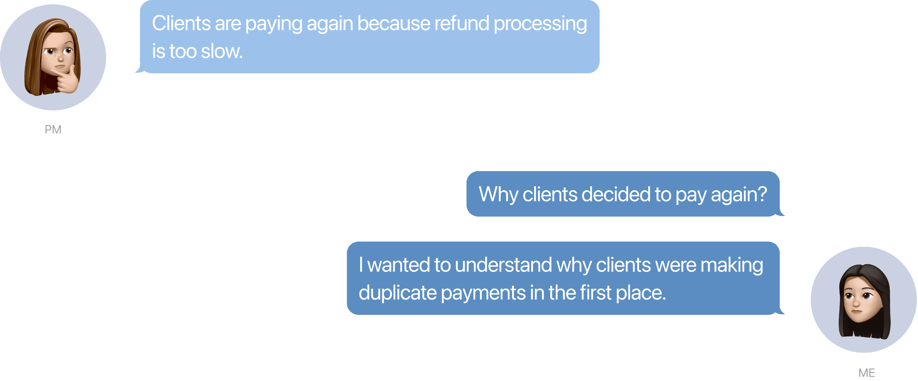
The team initially believed duplicate payments were caused by slow refund processing.
The team had observed a pattern, but it hadn't yet been validated through user research. That raised a question for me: Why were clients making duplicate payments in the first place?
Research
Rather than assuming the problem was slow refunds, I investigated how clients decided when to add funds:

02
Competitive Analysis
Reviewed 20+ digital wallets to identify patterns for presenting usable balances.


key insight
Clients weren't running out of money. They couldn't trust the balance they were seeing.
Because balance information was scattered across emails, invoices, and project pages, clients couldn't confidently decide whether to reuse existing funds or pay again.

"Does this remaining balance include pending or allocated funds? What's the actual balance I can use?"
— Operations lead
How I changed the strategy
From refund speed to helping clients understand their available balance.
Initially, the team prioritized faster refunds because it seemed like the most direct solution. After walking the PM and CEO through the research findings, we aligned on a different direction: improving balance clarity first. The CEO also pointed out that this approach naturally supported the company's long-term TEQ roadmap.
Defining MVP
We translated the strategy into an MVP focused on three design priorities:

Balance breakdowns
Make each balance state immediately understandable.
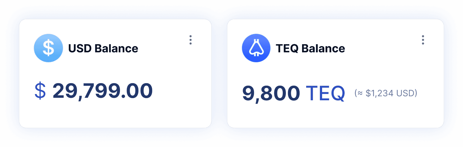
Dual-currency balances
Support today's USD workflow while preparing for future TEQ adoption.
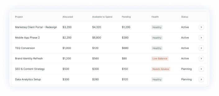
Project-first information hierarchy
Organize financial information around how clients make spending decisions.
Decision 1: How do clients understand their available funds?
Before designing the interface, I first defined what each balance should communicate:
Balance breakdowns
insight
It only shows the "remaining balance" for now. However, interviews showed that clients were unsure whether that included "allocated" and "pending."

exploration
Making balance states explicit
I worked with an engineer to understand how balances were stored in the backend.
While the system already tracked available, allocated, pending, and reserved funds separately, clients only saw a single "remaining balance."

Breaking down the remaining balance

final decision
Visualizing fund allocation
After testing, clients preferred seeing the distribution of their balances across different states instead of only the numbers.

Dual-currency balances
exploration
One balance or separate currencies
Initially, I considered showing the total amount in a card, although that reduced screen space, it increased clients' cognitive load.

I switched to a toggle view because it would scale more easily if additional currencies were introduced in the future.

final decision
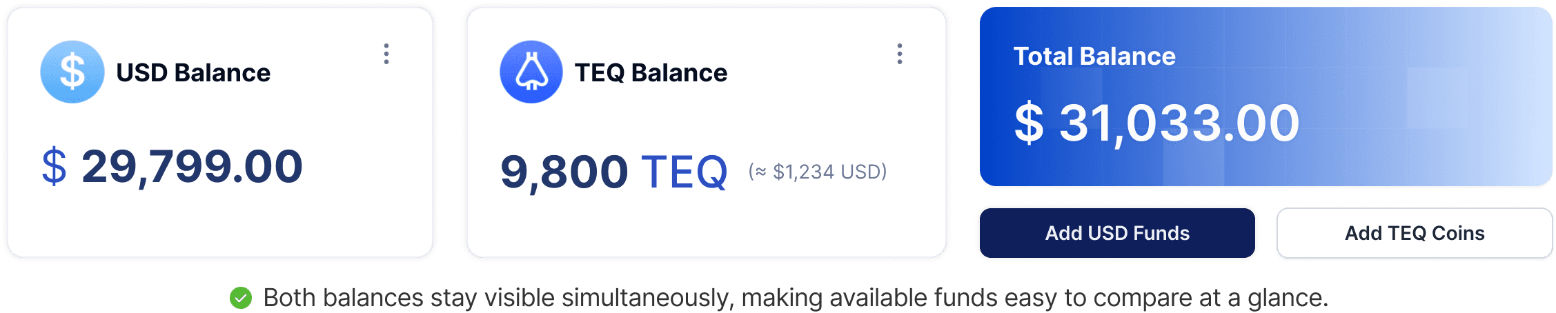
Side by side display
After testing, most clients were more familiar with the USD balance and didn't want it to be mixed up, keeping both balances visible reduced comparison effort while avoiding confusion between USD and future TEQ.
Decision 2: How should financial information be organized?
Once clients understood their balances, the next question became how to organize that information so they could confidently decide where to spend next.
Project-first information hierarchy
exploration
System model vs Mental model
Engineer suggested organizing balances by funding state because that's how the backend stored the data.
However, interviews showed that clients make payment decisions project by project.

To balance both the technical constraints and users' mental model, I kept the existing backend structure while reorganizing the interface around projects.

final decision
Surface financial status at three levels: account - project - portfolio
I reorganized the experience to three levels around the client's mental model. This kept each project's financial context together while still providing an overall budget overview.

final design
A balance system built for confident spending decisions
The final experience combines balance visibility with a project-first structure, helping clients understand available funds, track project budgets, and know when another payment is needed.


Impact
A scalable balance model that solves duplicate payments and supports future TEQ adoption.
Business outcomes
Shifted the product strategy from refund speed to balance clarity.
Reduced duplicate payment attempts by helping clients understand reusable funds.
Established a scalable balance model for future TEQ adoption.
How I measured
I ran a comparative usability study with 8 returning clients, testing identical tasks across the existing workflow and the redesigned prototype.
+45%
Clearer balance visibility
-62%
Fewer duplicate payment attempts
What stakeholder said
"Jessica's work was very detailed, and grounded in real-world logic, exactly what you need when designing financial experiences."
Christopher Torres
CEO, Director of UX
Reflection
Building a scalable foundation.
Building my first 0→1 startup product taught me that validation comes from aligning research findings with business goals, technical constraints, and the product roadmap. Designing the right solution meant solving today's problem while building a foundation the product could grow on.
Design around decisions, not data.
Through interviews and testing, I realized that financial information should be organized around how clients make payment decisions, not how balances are stored in the system.
